Skip to content
Talk to an engineer

Design

29 interfaces, each in a different design system.

Most teams can name a design system. Fewer can hand you a screen built to one, in its real colors, at its own density, with its own idea of what a table is, and show you what it measured. These are ours, one per system, with the brief and the numbers beside each.

The order

Ordered by how much of each screen a reader can judge from the frame alone: the six where the design itself is the argument, then the system this firm runs on, then the enterprise work in descending order of what it asks of the system it is built in. Not a ranking of how well each one is made.

29 of 29 screens

01 – 08

The eight where the design is the argument.

A photographer’s masthead that still owes a results table, a restaurant where the photograph carries the page, a midwifery practice set in the quietest register here, a chapter under translation whose two halves do not correspond, an editorial spread built on utilities alone, a club site that refuses its framework’s default template, a delivery depot planned overnight in a car maker’s own language, and a race stopped four laps early in another’s.

  • Noa Ferreday, built in Apex brand (house style)01.

    Apex brand (house style)

    Noa Ferreday

    A competitor's own brand site, where the season is the subject rather than the decoration. The near-black and the acid accent are one colour at two strengths, two typefaces split one name between them, and every heading arrives out from under a bar of the accent. Three rows of the results ladder carry no bar at all, for three different reasons.

    Archetype
    Editorial spread
    Stance
    Chart-first
    Density
    Generous, display-led
  • Solviva, built in Luxury hospitality02.

    Luxury hospitality

    Solviva

    The least dense page here by a wide margin. Photography carries it, type gets out of the way, and every scrim came from a measurement.

    Archetype
    Editorial spread
    Stance
    Prose-first
    Density
    Generous
  • Recto, built in Claude brand style (house style)04.

    Claude brand style (house style)

    Recto

    A chapter under translation, source and English in one grid so a paragraph and its translation cannot drift apart. The hard state is the thing a split pretends cannot happen: one paragraph rendered as three, a sentence with no source, and a stanza that cannot ship. There is no toolbar: every control sits in the margin at the segment it changes.

    Archetype
    Split
    Stance
    Prose-first
    Density
    Comfortable, reading
  • Nightshift, built in Tesla (brand language)07.

    Tesla (brand language)

    Nightshift

    A depot's overnight charge plan in a language built for a showroom. The brand publishes one chromatic colour and forbids a second, so the three vans that will not reach their departure charge are marked by a bar that stops short, a hatched gap and a number, never by red.

    Archetype
    Canvas
    Stance
    Chart-first
    Density
    Comfortable, 14px
  • Brackenhill, built in Ferrari (brand language)08.

    Ferrari (brand language)

    Brackenhill

    A race stopped four laps early by a red flag, so the classification is the order at the end of the previous lap. The sheet carries both orders (what the result is, and what the grandstand watched) because the second one is the question every results table starts and none of them answers.

    Archetype
    Editorial spread
    Stance
    Table-first
    Density
    Generous

09 – 17

Three more brand languages, the house system twice, and four that ask the most of theirs.

A launch manifest with no colour in it at all, a coffee order on the morning the milk ran out, and the console this firm runs itself on beside the landing page that sells it. Then a research cluster’s queue that tells a job which will never run apart from the ones merely waiting, a condensed grid at the density its operator actually works in, a service a stranger reaches in a bad week, a route still correct at the largest type the platform offers, and a merchant’s bulk action gated behind a typed confirmation.

18 – 29 And twelve more, from a service agreement to a public lookup.

A service agreement where the path is a real state machine. A ward handover where the thread takes the primary column. A posture wall that refuses the eleventh tile. A teacher reading the day in a corridor. An approval queue split down the middle. A schema change reviewed the way code is, with the lock analysis attached. A canvas whose panels genuinely close. A twelve-step scale used as visible roles. A faceted index over a physical material. The densest page in the set, at a hundred and forty consignments, a board where every drag has a keyboard twin, and a public lookup that has to work first time.

The one that is not a screen

A real-time exhibit, held to the same rules.

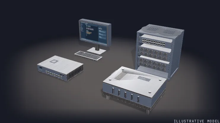
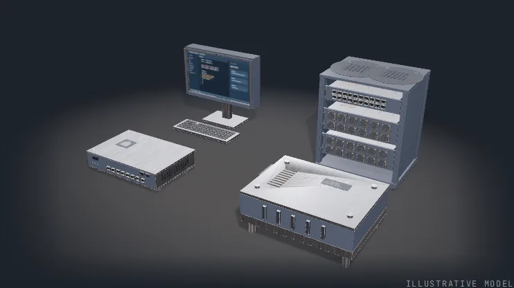
Twenty-two of the screens above are documents. This one is a WebGL render of four teaching assemblies, built to the same generated palette, measured against the same contrast floors, and reachable by keyboard for everything the pointer can do. Pick a division and it opens.

Real-time render · WebGL

Four divisions, drawn as four machines.

Each assembly is modelled from the work its division actually does, comes apart along designed axes, and names its own parts as it opens. The materials, the lighting and the camera are the scene’s own; nothing here is a photograph and nothing is stock.

The four assemblies are teaching models, not any client's equipment and not a product this firm sells. Nothing in the frame is a measurement: there are no completion figures, no latency numbers and no customer names.

Illustrative model

Next step

Bring us your design system.

If your team already has one, Computing America builds to it. If it does not, the first thing we hand over is the one above: tokens from a generator, the states nobody looks at, and the measurements that settled each decision.

Reply
A person replies, not a sequence: within one business day, from someone who would be on the engagement.