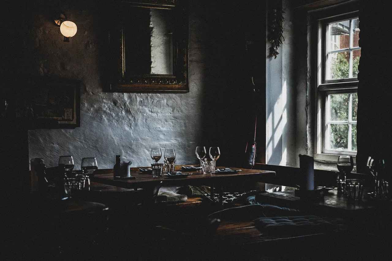
Cala Rotja · Menorca
Solviva
Twenty-four covers above the water. One menu each evening, written after the boats come in.
The room
Two services a night, one seating each
Dinner is at seven and at nine, Tuesday to Saturday. Nine tables and a six-seat counter face the water and the charcoal.
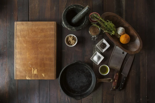
Marc Ferrer cooks what the Ciutadella boats land that morning. He writes the menu at four and prints it at six, so nobody knows what dinner is until the afternoon.
One dish
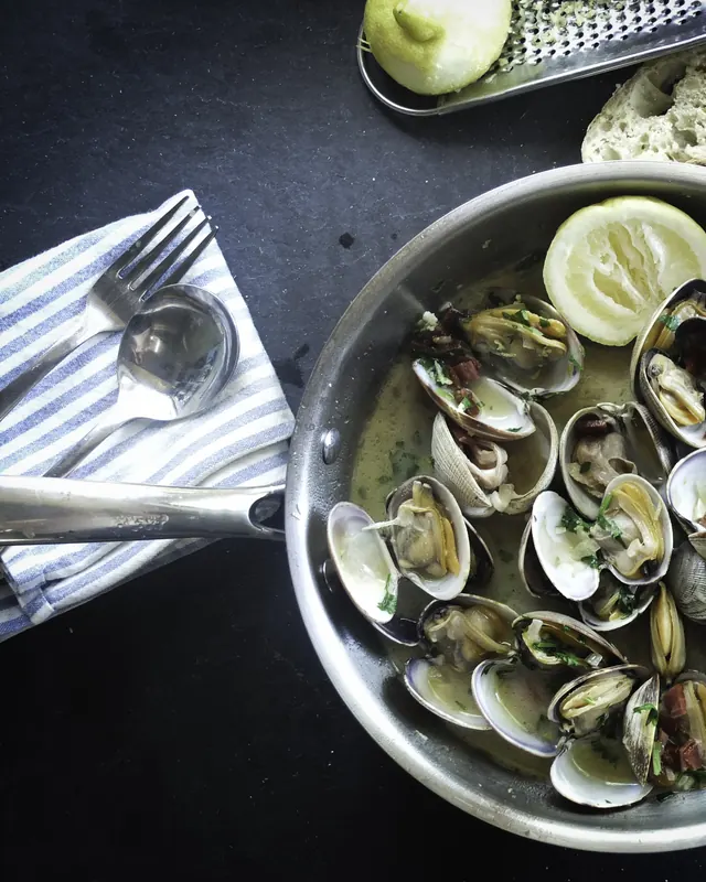
The clams come up at eleven and leave the pass by eight
Joan rakes them off the sand at Cap de Cavalleria and drives them down the same morning. The kitchen opens them rather than the boat, and they reach the menu only on the days he goes out.
The counter
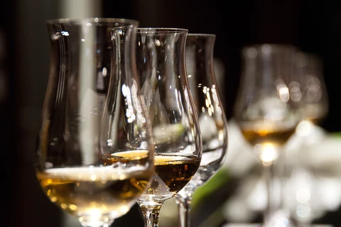
Six seats facing the fire, held back until the day
The counter is not bookable in advance. It opens at noon on the day for that evening, two seats at a time, by telephone only.
Closed on Sunday 13 September. The kitchen runs Tuesday to Saturday.
The next table for two is Tuesday 15 September at nine. Wednesday 16 September at seven, if that suits you better. Two seats at the counter open at noon on the day, by telephone.
Design notes
Solviva
- Shape of the page
- An editorial spread. Full-width photograph, then a narrow column of writing, then photograph again, the way a printed magazine sets a feature.
- What it leads with
- Sentences. The set menu carries one price, written out in words, and the only figures on the page are the opening hours.
- Spacing
- Generous. Sections sit a long way apart, at the two largest steps on the scale, because the pace of the page is part of what it is selling.
- The one bold decision
- The photograph runs the page and the type stands aside. Nothing is ever set over an image until the darkening behind it has been measured.
- Where the colour comes from
- Every colour, type size and spacing step is taken from the system rather than sampled by eye, so the two rooms this page can be in are consistent with each other.
- Text over a photograph
- The worst pixel under every block of text was measured, and the darkening asked for. What the page actually paints there is heavier than what was asked for, so the text clears its floor even over the brightest part of the image.
- Readability, measured
- Body text on the night ground measures 17.76:1, and the brass accent on it 8.36:1. Higher is easier to read, and 4.5 is the accessibility floor.
- Moods, not themes
- Night and day here are which room the page is in, not a setting somebody chooses, so there is no switch. The dining room is night and the menu is day.
- Type
- A serif for display and the reader's own system face for text. The page loads no web font at all, so nothing shifts or flashes while it arrives.
- Photographs
- Four photographs, all free of any copyright claim, each served in modern formats at several sizes so a phone downloads about 100 kB and a large laptop about 200 kB. Where each one came from is recorded beside them.